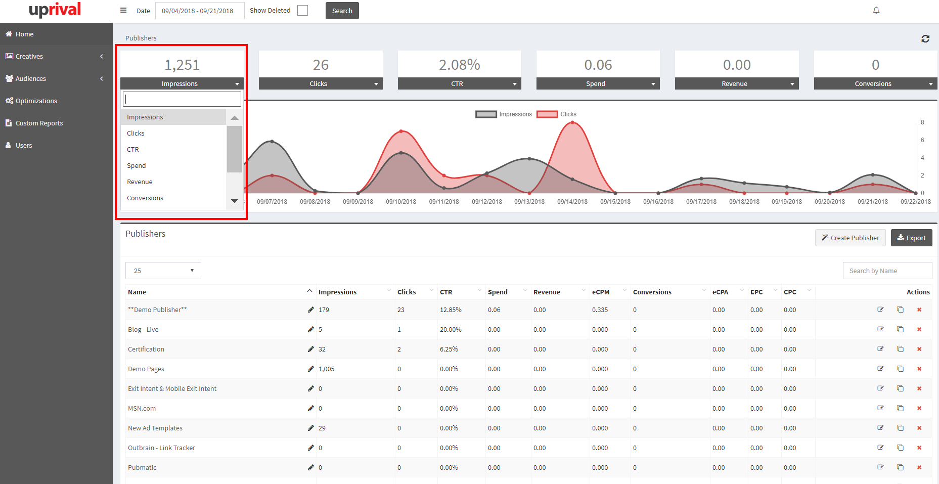
Quick Stats and Custom Graphs Dashboard
Explanation of the statistics graph and dashboard on UpRival's home page.
On the home page directly under Publishers (and also located on the Placements page), there’s a graph that will show you the totals for both impressions and clicks based on the date range chosen.
The boxes above this graph show various key performance indicators (KPIs), which can be customized to show the metrics you care about most. This is done by clicking on the small down arrow found on the far right side of each column.